EE
- 456 / E01 spring 2003
Advanced
Communications Theory
Professor:
Arida
Submitted
By:
Andrew
Buettner
Lab
#2: Sampling and Basic Signal Processing
Sunday, April 06, 2003
Table
Of Contents
1)
Cover Page 1
2)
Table of Contents 2
3)
Objective 3
4)
Components Used 3
5)
Procedures 3
6)
Lab Data / Results 3
1) Diagram
1 4
2) Diagram
2 4
3) Diagram
3 5
4) Diagram
4 5
5) Diagram
5 6
6) Diagram
6 6
7) Diagram
7 7
8) Diagram
8 7
9) Diagram
9 8
10) Diagram
10 8
11) Diagram
11 9
12) Diagram
12 9
13) Diagram
13 10
14) Diagram
14 10
15) Diagram
15 11
16) Diagram
16 11
17) Diagram
17 12
18) Diagram
18 12
19) Diagram
19 13
20) Diagram
20 13
21) Diagram
21 14
22) Diagram
22 14
7)
Answers to Lab Questions 15
8)
Conclusions 16
9)
Attachments 16
Objective
The objective of this
lab is to explore the effects of aliasing and sampling.
Components Used
1) PC with MatLab®
installed
2) Sampling
board
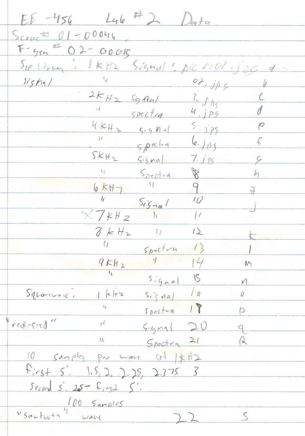
3) Spectrum Analyzer #12345
4) Oscilloscope #01-00046
5) Function generator
#02-00015
Procedures
1) Enter command "fir(1)"
2) Enter command
"ssrat(10000)"
3) Set the function generator
to generate a 1KHz signal with amplitude of 2V.
4) Connect the signal
generator to the input of the sampling board.
5) Connect
the output of the sampling board to the oscilloscope and the
spectrum analyzer.
6) Record
the signal spectrum and observe the aliasing that occurs as a result
of sampling.
7) Record the resulting
signal.
8) Increase the signal
frequency to 2KHz.
9) Record the resulting
signal and spectrum.
10) Repeat steps 6 and 7 for
4KHz, 5KHz, 6KHz, 8KHz, and 9KHz.
11) Repeat
steps 6 and 7 for a 1KHz squarewave and explain the spectrum.
12) Set the function
generator to generate a 1KHz sinewave.
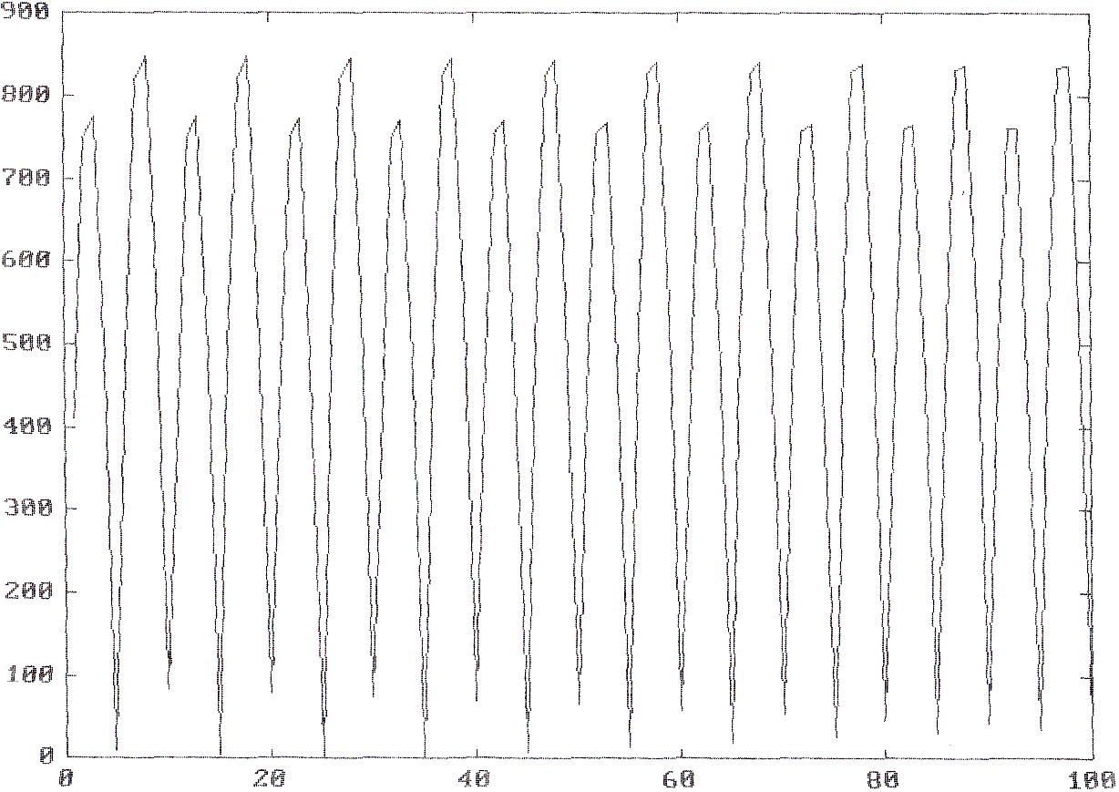
13) Enter command "x=ad(100)"
to generate a 100 sample array.
14) Plot the resulting
function.
15) Rectify the signal using
"x1=abs(x);"
16) Plot the new signal.
17) Enter command "da(x1);"
18) Record the resulting
waveform and spectrum.
19) Simulate a semi square
sawtooth waveform with amplitude 1024 and a frequency of 1KHz.
20) Use the "da(x)"
function to realize the waveform.
21) Record the output time
signal.
Lab
Data / Results
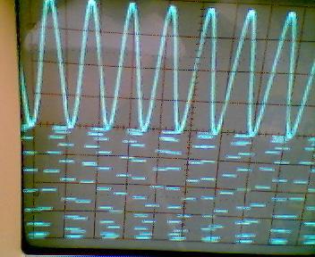
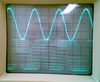
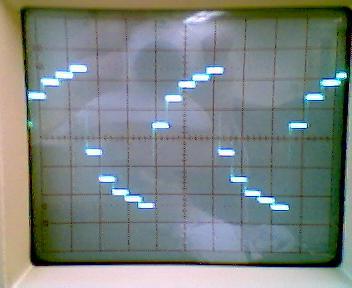
1) Diagram 1: 1KHz Sinewave
Signal
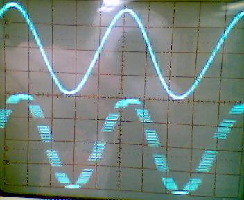
2) Diagram 2: 1KHz Sinewave
Spectra
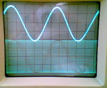
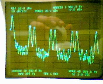
3) Diagram 3: 2KHz Sinewave
Signal
4) Diagram 4: 2KHz Sinewave
Spectra
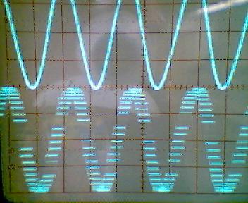
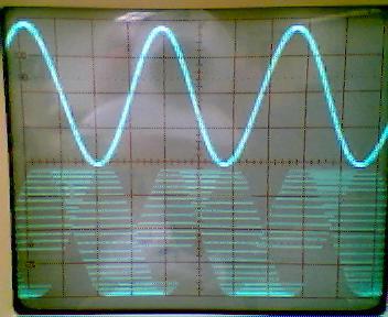
5) Diagram 5: 4KHz Sinewave
Signal
6) Diagram 6: 4KHz Sinewave
Spectra
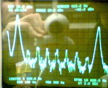
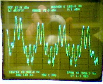
7) Diagram 7: 5KHz Sinewave
Signal
8) Diagram 8: 5KHz Sinewave
Spectra
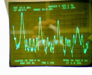
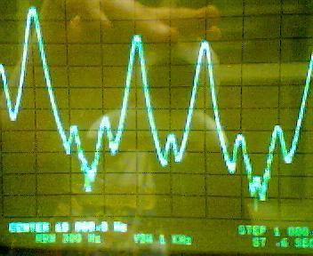
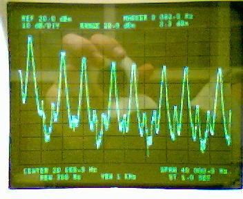
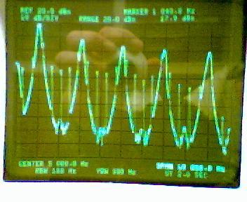
9) Diagram 9: 6KHz Sinewave
Signal
10) Diagram 10: 6KHz
Sinewave Spectra
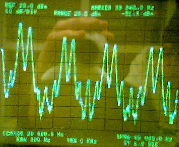
11) Diagram 11: 8KHz
Sinewave Signal

12) Diagram 12: 8KHz
Sinewave Spectra
13) Diagram 13: 9KHz
Sinewave Signal
14) Diagram 14: 9KHz
Sinewave Spectra
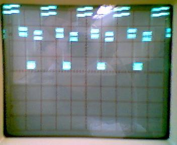
15) Diagram 15: 1KHz Square
wave Signal
16) Diagram 16: 1KHz Square
wave Spectra
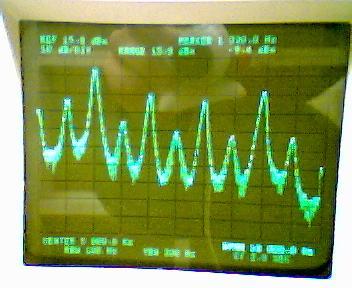
17) Diagram 17: Captured
Sinewave
18) Diagram 18: "Rectified"
Signal Output
19) Diagram 19: "Rectified
Signal" before replication
20) Diagram 20: "Rectified"
signal spectra
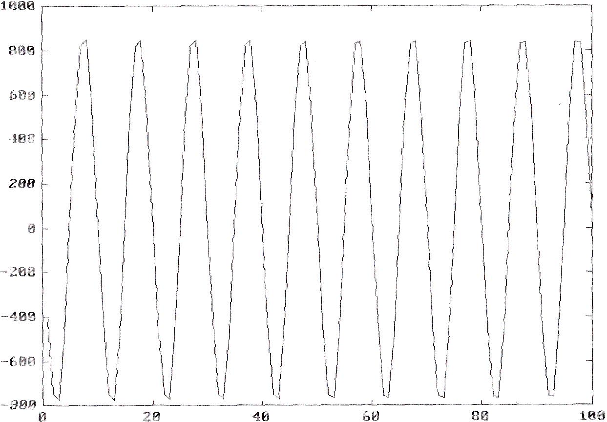
21) Diagram 21: Synthesized
"Saw tooth" wave.
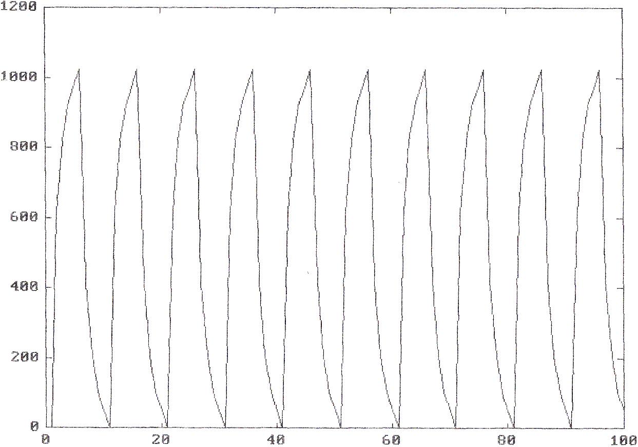
22) Diagram 22: Realized
"Saw tooth" Wave
Answers to Lab Questions
1) Q:
Describe the spectrum for the following conditions: A signal
described by x(t) = 2*cos(wa*t)
+ cos(wb*t) is
sampled at frequency ws.
Give the spectrum for the following combinations of wa
and wb:
a) wa
= .1ws, wb
= .2ws
b) wa
= .2ws, wb
= .4ws
c) wa
= .4ws, wb
= .6ws
A: a) 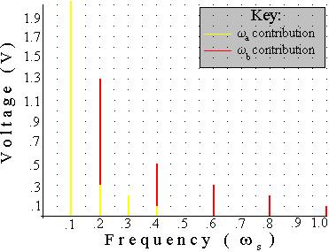
b) 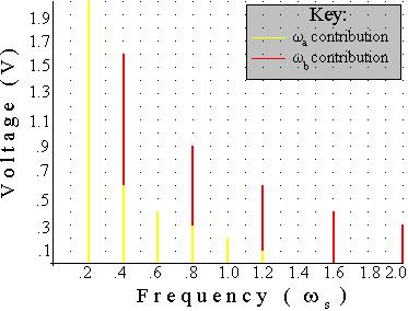
c) 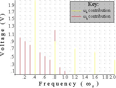
2) Q: Write
MatLab® code to create a square wave off of a sinewave, given
array x is a sinewave.
Conclusions
This lab has demonstrated some of the effects that sampling has
on a signal. However, some of the effects of signal aliasing were
not observed. It is interesting at how much noise is introduced
into a signal even though the signal is sampled well below it's
Nyquist rate. The answers portrayed in Q1 attempt to show the
amount of noise that is introduced. This is expected, and signal
generation may also be a source of noise that can not be explained,
especially noise that is amplified by the analog to digital
conversion, because it is above the Nyquist rate. I did, however,
experiment and ran the signal at and above the Nyquist rate. At the
Nyquist rate, the signal appeared as a perfect "white"
signal, or as straight lines. As the frequency was increased, the
noise created shadows, or darker areas that appeared to be a signal
at wm - .5ws.
This is expected, and is explained within the Nyquist theorem.
Attachments
Original lab handout
Original lab data
Calculations
MatLab®
log
fir(1)
¯
ssrat(10000)
¯
x=ad(100);
¯
plot (x)
¯
x1=abs(x)
x1
=
Columns 1 through 12
410 747 776 491 11 484 818 849 562 84 414
747
Columns 13 through 24
774 487 5 489 820 848 559 79 419 750 773
483
Columns 25 through 36
1 492 821 847 555 75 422 751 771 479 4
497
Columns 37 through 48
824 846 552 69 427 754 771 476 8 500 825
844
Columns 49 through 60
547 64 430 754 768 470 14 506 828 842 544
58
Columns 61 through 72
436 757 768 467 19 509 828 841 538 54 440
757
Columns 73 through 84
765 462 25 515 831 840 535 47 445 760 765
458
Columns 85 through 96
30 518 833 837 530 43 448 761 762 453 35
524
Columns 97 through 100
835 836 527 37
¯
x1=abs(x);
¯
plot(x1)
¯
da(x1)
¯
x2=0:100;
¯
x2(0)=0;
ÛÛÛ
Index into matrix is negative or zero.
¯
x2(1)=0;
¯
x2(2)=1.5;
¯
x2(3)=2;
¯
x2(4)=2.25;
¯
x2(5)=2.375;
¯
x(6:10)=2.5-x(1:5)
x
=
Columns 1 through 7
-410.0000 -747.0000 -776.0000 -491.0000 -11.0000 412.5000 749.5000
Columns 8 through 14
778.5000 493.5000 13.5000 -414.0000 -747.0000 -774.0000 -487.0000
Columns 15 through 21
-5.0000 489.0000 820.0000 848.0000 559.0000 79.0000 -419.0000
Columns 22 through 28
-750.0000 -773.0000 -483.0000 -1.0000 492.0000 821.0000 847.0000
Columns 29 through 35
555.0000 75.0000 -422.0000 -751.0000 -771.0000 -479.0000 4.0000
Columns 36 through 42
497.0000 824.0000 846.0000 552.0000 69.0000 -427.0000 -754.0000
Columns 43 through 49
-771.0000 -476.0000 8.0000 500.0000 825.0000 844.0000 547.0000
Columns 50 through 56
64.0000 -430.0000 -754.0000 -768.0000 -470.0000 14.0000 506.0000
Columns 57 through 63
828.0000 842.0000 544.0000 58.0000 -436.0000 -757.0000 -768.0000
Columns 64 through 70
-467.0000 19.0000 509.0000 828.0000 841.0000 538.0000 54.0000
Columns 71 through 77
-440.0000 -757.0000 -765.0000 -462.0000 25.0000 515.0000 831.0000
Columns 78 through 84
840.0000 535.0000 47.0000 -445.0000 -760.0000 -765.0000 -458.0000
Columns 85 through 91
30.0000 518.0000 833.0000 837.0000 530.0000 43.0000 -448.0000
Columns 92 through 98
-761.0000 -762.0000 -453.0000 35.0000 524.0000 835.0000 836.0000
Columns 99 through 100
527.0000 37.0000
¯
x(6:10)=2.5-x(1:5);
¯
x2(6:10)=2.5-x2(1:5);
¯
x2(11:20)=x(1:10);
¯
x2(11:20)=x2(1:10);
¯
x2(21:40)=x2(1:20);
¯
x2(41:80)=x2(1:40);
¯
x2(81:100)=x2(1:20);
¯
plot(x2)
¯
x2(100)
ans
=
0.1250
¯
x2(101)
ans
=
100
¯
x2(101)=0;
¯
plot(x2)
¯
help plot
PLOT Plot
vectors or matrices. PLOT(X,Y) plots vector X versus
vector
Y. If X or Y is a matrix, then the vector is plotted
versus
the rows or columns of the matrix, whichever lines
up.
PLOT(X1,Y1,X2,Y2) is another way of producing multiple
lines
on the plot. PLOT(X1,Y1,':',X2,Y2,'+') uses a
dotted
line for the first curve and the point symbol +
for
the second curve. Other line and point types are:
solid - point . red r
dashed -- plus + green g
dotted : star * blue b
dashdot -. circle o white w
x-mark x invisible i
arbitrary c1, c15, etc.
PLOT(Y)
plots the columns of Y versus their index. PLOT(Y)
is
equivalent to PLOT(real(Y),imag(Y)) if Y is complex.
In
all other uses of PLOT, the imaginary part is ignored.
See
SEMI, LOGLOG, POLAR, GRID, SHG, CLC, CLG, TITLE, XLABEL
YLABEL,
AXIS, HOLD, MESH, CONTOUR, SUBPLOT.
¯
¯
plot(x2)
¯
x3=409.6.*x2;
¯
plot (x3)
¯
plot (x3)
¯
x4(1:100)=x3(1:100);
¯
plot(x4)
¯
da(x4)
¯
quit
117 flop(s).